Cambodia Angkor air
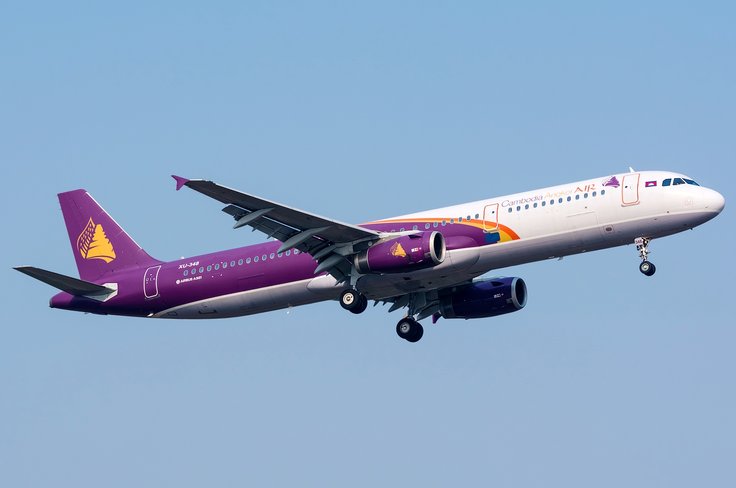
The logo represents the Angkor Wat temple symbol & also the bird wing used on the low-relieves at Angkor Wat. It is complemented by a stylized bird wing, referring to fluidity and elegance: the strength and the beauty of the temple, the agility and the speed of the bird. These two components complement each other to describe the qualities of safety and performance that any traveler expect from an airline, with a typical Khmer beauty that brings a special touch of personality to the company.
COLORS
The first part of the name is written in dark purple. Purple expresses the alliance of the blue (security and calm) and the red (strength and passion). The purple is transferred the golden yellow- a Royal color and Cambodia’s traditional symbol of prosperity.
Tahe word “Air” is treated with a specific color (warm saffron) and a specific font, in order to boost the logo and to reduce its length. The painting of the plane uses these three colors on the back of the fuselage, plus an elegant and modern grey (50% black with red).